How might we help children navigate and recognize interfaces more intuitively across different experiences?
In this project redesigned Live Library, a feature within I-NARA, a children’s learning and play app operated by LG U+.
The goal was to build a unified and accessible experience by aligning Live Library with the visual tone and interaction style of the main platform.
The redesign strengthened visual consistency and intuitive usability, allowing children to easily recognize buttons, functions, and navigation patterns.
As the sole UX designer, I worked with UI Designer and developers to refine the tone, color system, and UI depth, ensuring that the 3D content and interface blended naturally into I-NARA’s familiar environment.
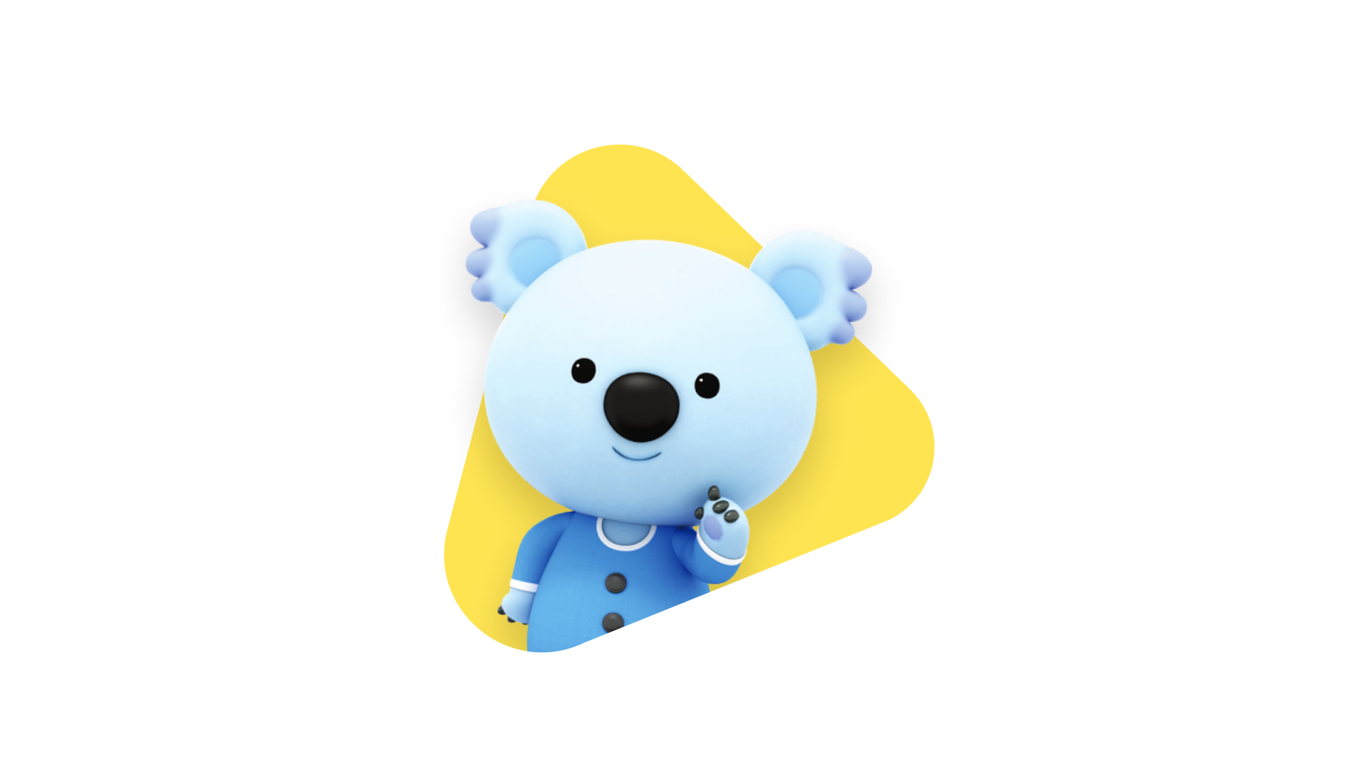
I-NARA
Deliverables
Visual Design & UI Kit
GUI
Prototypes
Design Guidelines
Role
UX Designer
Team
1 UX Designer
1 UI Designer
3 Engineers
TimeLine
Apr – Oct 2022
Context
Bridging Two Worlds
‘I-NARA’ is a learning and play platform for children provided by LG U+, designed to allow preschoolers to safely and easily enjoy a variety of educational content across TV and mobile environments.
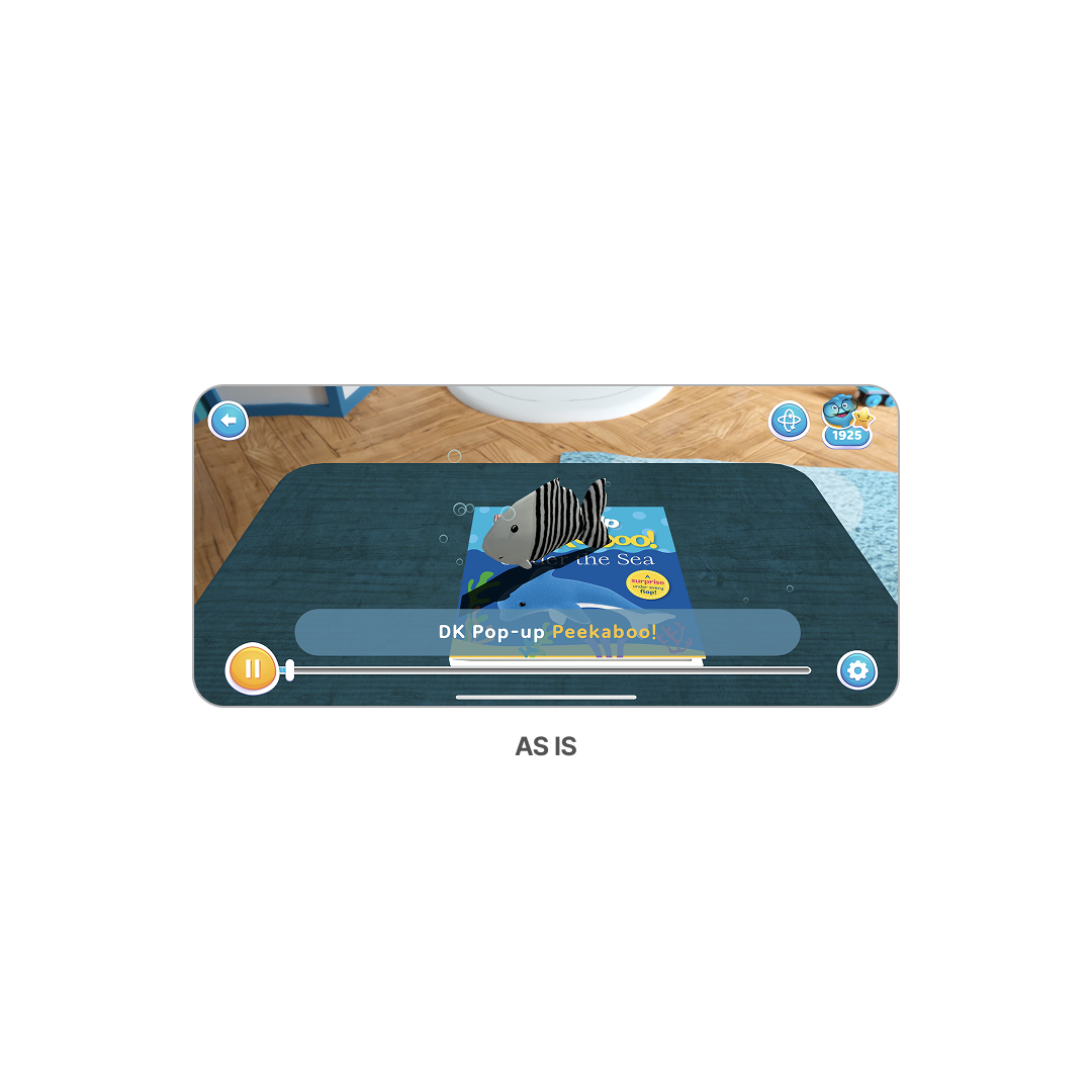
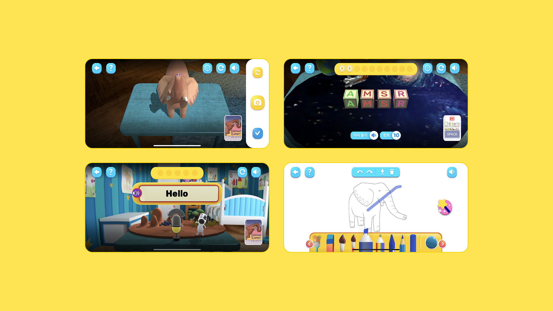
Meanwhile, ‘Live Library’ is a 3D pop-up book–style service where children can visually explore stories through immersive scenes and animated characters.
The goal of this project was to bridge the visual and stylistic gap between the two services, aligning their tones and character styles to create a seamless, cohesive user experience.
Within I-NARA’s friendly graphic system, the new design aimed to naturally blend Live Library’s immersive 3D environment and interactive experiences into one integrated interface.

Problem Definition
The previous Live Library UI used a different visual tone and style from the main I-NARA app and created a fragmented experience that weakened overall cohesion.
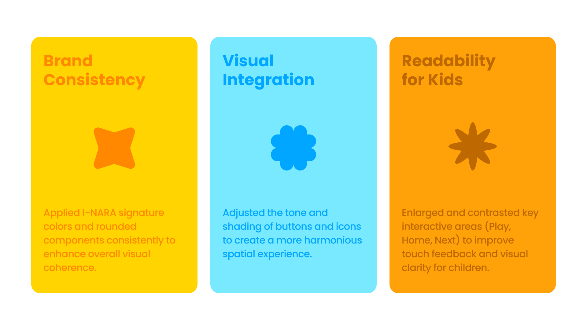
Low button visibility and the absence of intuitive feedback made it difficult for children to understand their current state during interaction. To solve these issues, the redesign emphasized brand consistency, visual integration, and readability for children, ensuring that every element worked together as one coherent system.
The goal was to maintain the immersive nature of the 3D content while blending it naturally into I-NARA’s tone and manner to create a unified design system.
Design
Visual System Refinement
The redesign refined the overall tone and clarity of the interface to align with I-NARA’s friendly visual language.
Button shapes and color tones were adjusted to create stronger contrast and help children recognize functions more intuitively.
In addition, subtitle areas were rebalanced in brightness and color tone, enhancing both readability and immersion across different types of 3D content.

Unified Brand Identity
The previous content used independent characters that did not align with I-NARA’s brand tone and weakened visual consistency across the service.
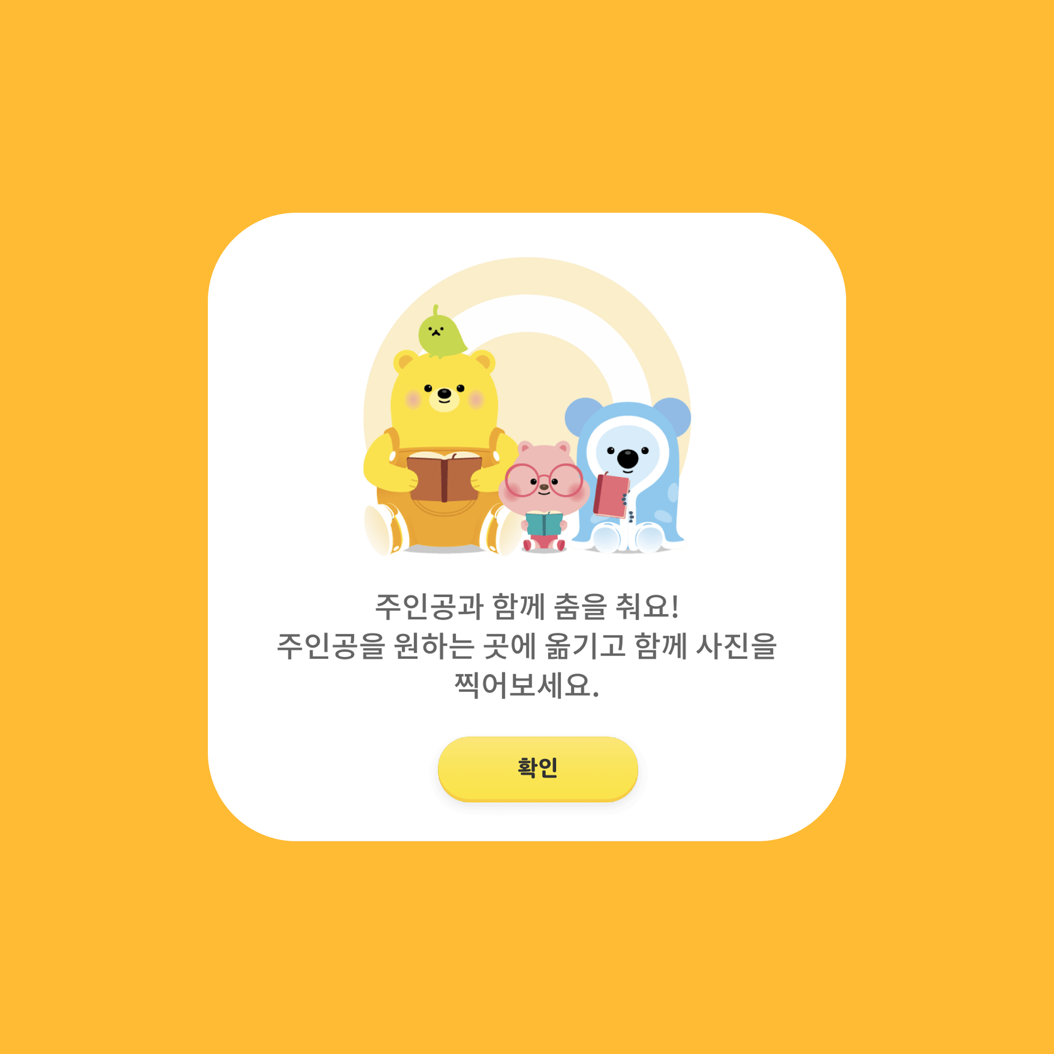
The redesign replaced these characters with I-NARA’s official mascots, Yuppi and Friends, and integrated them into key user touch points such as pop-ups and quiz buttons to create a unified brand experience.
The GUI was also rebuilt with I-NARA’s color palette and component system, strengthening visual coherence and emotional familiarity. Button feedback and audio cues were refined to suit children’s cognitive levels, providing a seamless and engaging learning experience.


Reflection
Although it was a small-scale improvement project, it became a valuable opportunity to explore the balance between consistency and sensitivity in design. Through subtle adjustments that deepened the design without disrupting the existing tone, I realized how much visual refinement depends on attention to detail.
As my first project at LG U+, I also worked on banner design and service operation tasks, which allowed me to understand how a project moves from planning to development and daily operation.
This experience helped me grasp how collaboration and small design decisions contribute to overall brand consistency and user experience.