
How can I communicate my emotions and identity without words, through my ringtone?
This project, conducted at LG U+, aimed to improve the usability of a legacy app and introduce a new way for users to express and share emotions through their ringtones.
As the sole UX designer, I focused on creating an experience that goes beyond simple settings, offering a personalized and emotionally engaging interaction.
I worked closely with the lead developer and the engineering team to balance technical constraints, business goals, and user needs.
MUSIC BELLING
Deliverables
User Research Report
UX Flow
Visual Design
GUI
Prototypes
Design Guidelines
Role
UX Designer
Team
1 UX Designer
1 UI Designer
5 Engineers
Timeline
Mar – Sep 2024
Context
Built to Convey Emotions, but Cutting Them Off
‘Musicbell’ is a service that plays a short greeting and music to the person receiving a call, replacing the default ringtone. It functions like an audio business card, allowing users to share a personal touch during calls.
Originally launched as an Android app in 2011, the service had not undergone a major update since 2016. For nearly a decade, its structure remained unchanged, reaching a point where a complete overhaul was needed both technically and visually.
In particular, inconsistent features and UI across platforms led to fragmented user experiences, while the search, setup, and purchase flows had become overly complex and confusing for users.
To address these challenges, a full redesign project including UX improvements and technical updates was initiated in September 2024. As the UX designer, I took the lead in redefining core problems, designing new user flows, and driving the entire redesign process.

Research
We conducted a large scale survey with 1,350 users and complemented it with workshops and VOC analysis to deeply understand how people experience call tone settings.
This mixed method approach allowed us to capture both quantitative data and qualitative insights, ensuring that we could see not only what users do but also why they feel that way.
Through this process, we were able to identify recurring pain points and establish clear directions for redesign, which later informed the key insights presented below.


Insight
The Three Insights That guided the Redesign
The research revealed recurring frustrations across different touchpoints. Beyond usability problems, users struggled with emotional disconnect and overwhelming personalization flows.
By reframing these challenges, we distilled three key insights that highlight the fundamental gap between users’ expectations and the actual service experience.


Emotional disconnect in the experience
Users expected self expression through MusicBelling, but the experience was reduced to mere settings without emotional depth.
Perceived complexity of multi element personalization
Users perceived the process of combining greetings and music as overly complicated, which discouraged active use.
Usability issues in the setup and navigation flow
The setup flow and navigation were not intuitive, preventing users from easily reaching their desired songs or features.
Taken together, the insights led us to ask:
“How might we make the ring tone experience more emotionally engaging and meaningful?”
Ideation
Emotional keywords from human communication were transformed into graphic metaphors, defining the emotional tone of the design. In addition, a helper character was introduced to support users intuitively and to enrich the experience with a sense of fun and delight.


Design process
To address the key pain points, we redesigned the user flow with a focus on usability and emotional engagement. Wireframes were created to simplify personalization, improve the navigation structure, and transform the setup process into a smoother, more expressive experience.

Solution
Designing for self expression and emotional connection
Based on the three insights, we developed design directions aimed at restoring emotional value, lowering barriers to personalization, and creating a smoother overall experience.
Home
The home screen was redesigned to highlight a clear before and after contrast.
Since most users accessed the app primarily for search, the search bar was repositioned at the top for greater visibility. To make the experience more enjoyable, we introduced customizable home charts and added a supporting character to enhance both usability and fun.


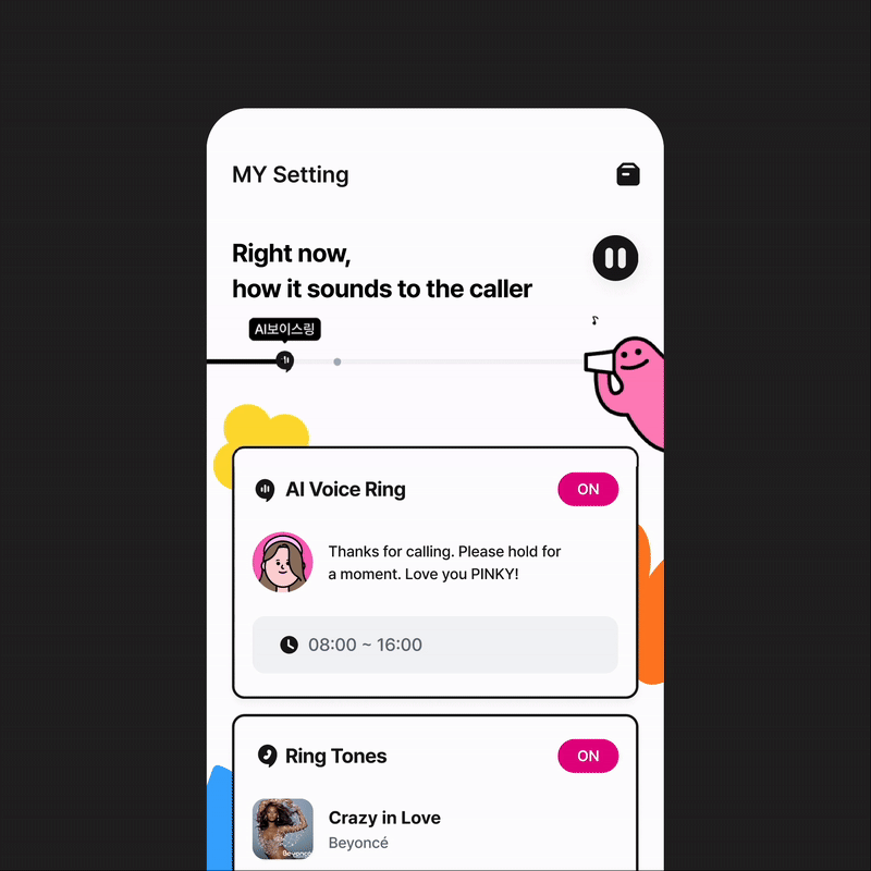
VoiceRing & Music Exploration
To help users better express the voice they want to share, we designed characters that visually represent different tones such as calm, energetic, cute, or comic.
Each category was paired with a distinct color palette, allowing auditory qualities to be visually recognized so that the personality of each voice could be conveyed more intuitively.

In the music exploration flow, the design went beyond simply setting a song. Users can search and browse charts quickly and intuitively, while also enjoying the process itself.
The goal was not just to simplify song selection, but to create an experience where music could be explored and enjoyed along the way.

Experience the Fun
The design moved beyond a simple setting task. Instead of ending with just configuring a greeting and ringtone, we created an experience where users could also enjoy the process itself. By introducing a preview feature, users can listen to their chosen greeting and ringtone exactly as the caller would hear it.
This not only improved usability but also added a layer of delight, making the act of setting up feel engaging and enjoyable.

Outcome
Design that Helps Users Share How They Feel
The redesign went beyond simple UI changes to deliver a simple, enjoyable, and refined experience.
After the redesign, a usability evaluation with 24 participants showed clear improvements:
average satisfaction reached 5.0 across all stages, outperforming competitors by +1.5 points on average.
In particular, AI VoiceRing achieved 96% user preference and over 90% attractiveness, validating that the redesign not only simplified the process but also made it easier for users to express and share their emotions.
Average satisfaction across all major stages
5.0
Higher scores compared to competitors
+ 1.5
Preference score for VoiceRing
96%
Reflection
This project was more than just improving usability.
It became an experience that made me think deeply about how people exchange and convey emotions through ring tones.
I found it challenging to provide diverse features while keeping the interface clear and intuitive, and it was also a limitation that testing was conducted with only a small group of users. Still, the process led me to new questions: How can auditory experiences be translated into visual forms? and how can technology be designed to communicate human emotions?